Home screen folder design
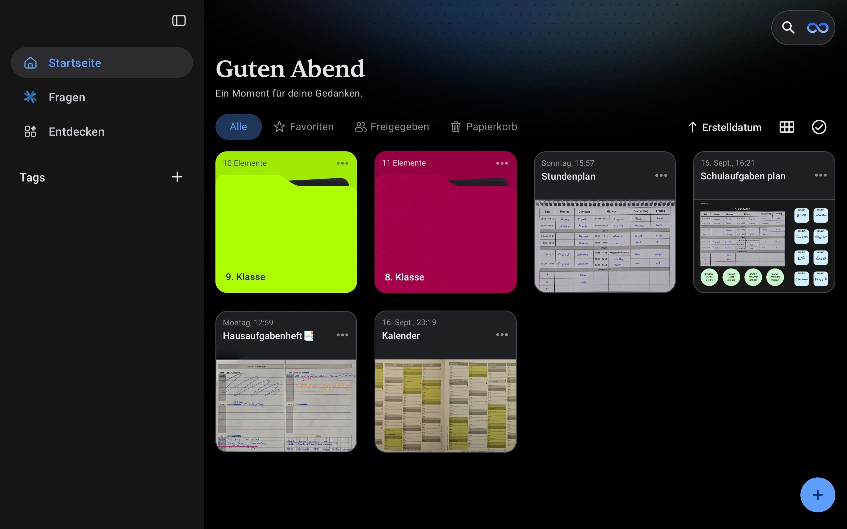
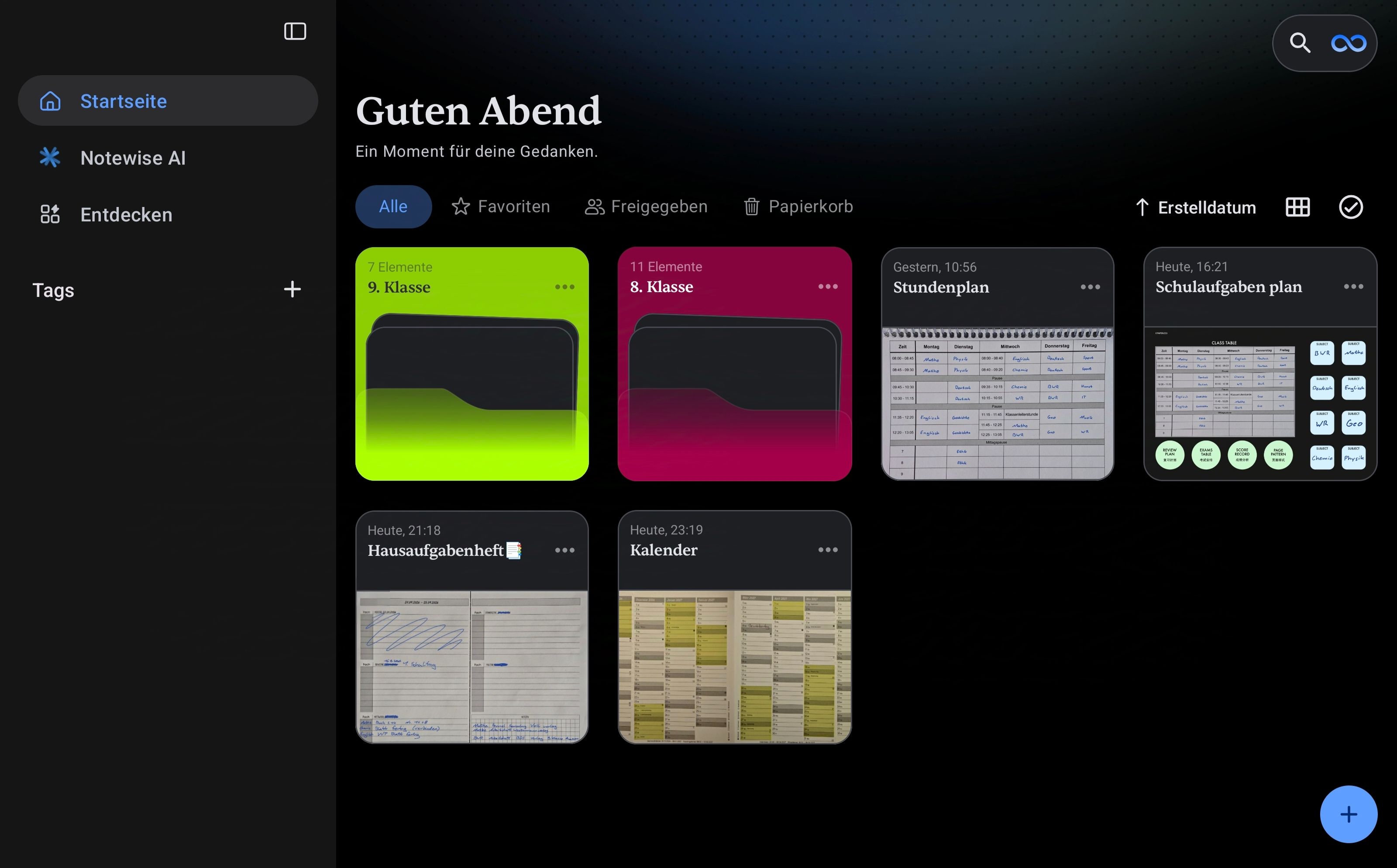
Why did they update the design? It used to be such a lovely design – the folders looked really modern and the font was lovely. And now the folders look completely flat, boring and ugly again, and the font is back to being completely standard! Please reverse this change. The first image shows the new, ugly design and the second image shows the old, lovely design.
- Post type
- 😊 General
Log in to comment and vote
Comments2
Blush Bat
Sep 25
Yes, absolutely correct. I thought it was a display error and even contacted support.Yes, absolutely correct. I thought it was a display error and even wrote to support about it.The design was so beautiful, it looked modern and was a perfect match for the Notewise. I definitely want another one.
Sapphire Honey
Sep 25
Absolutely agree with this! The old design looked much more modern, elegant, and visually appealing. The new flat folder design really feels like a step backward — please bring back the old translucent style! 🙌